Last September, I completed the user interface design of a learning package for a client, Future Social Service Institute (FSSI). Here is the story of my design process, of how the brand new FSSI online course package design evolved and came to life.
With so many available online learning and management platforms and different design themes to follow, it can be a nightmare to get started. While I did a lot of design and development versions for this FSSI online course design, I won’t show you every single design I made, nor will I only talk about the final product. This post is about the journey to the final product and all the significant stages of the process.
It starts with the client brief.
The Brief
There wasn’t much information in the client brief for the design of a brand new online learning package, but it did spell out a few things that the package had to have:
- the FSSI brand
- minimal navigation
- a modern design that was professional and suitable for all genders between the ages of 17-40yr)
- the ability to embed into any learning management system (LMS) like Canvas, Moodle, Blackboard, etc.
The design of the course package was down to me and I was given total creative freedom – this can be the best and fun, but it can also be very challenging.
The Goals
My main goals from a visual design point-of-view were to make it beautiful, striking, to suit the students’ age group and current digital literacy, and to match current web trends without it looking outdated in the next few years.
Stage #1: Nice to meet you – Understanding FSSI style guideline
I went to the FSSI website first to understand their organisation’s visual personality and culture. Their website is very simple with not much colour except black, white, and green.
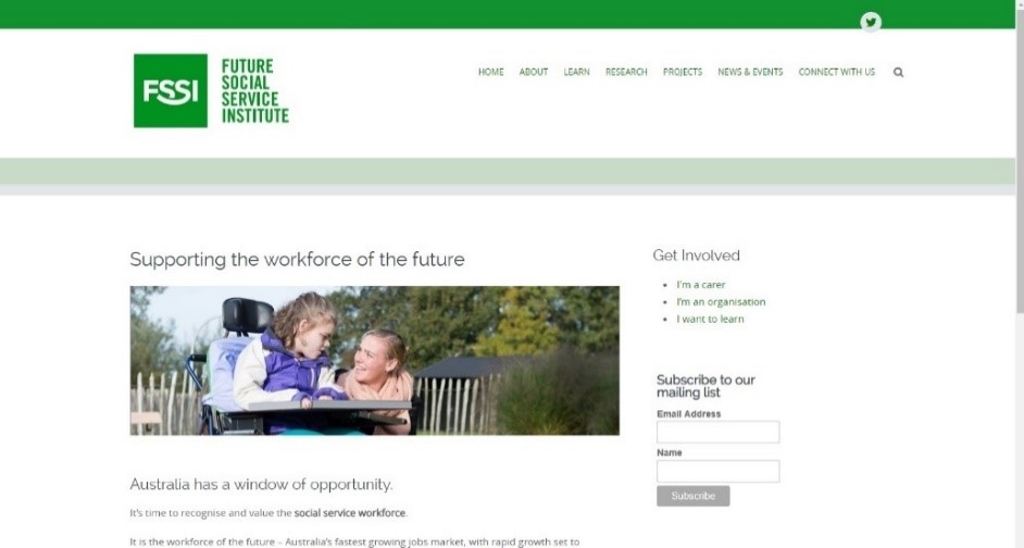
(FSSI website)
Stage #2: The start is hard, give it a go
After reviewing their branding guide, I did my first design mock-up in Adobe Illustrator.
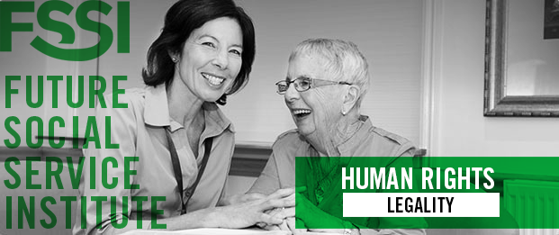
I had been really inspired by designs with clean photographs combined with large typography and I wanted to bring this into the FSSI course package design. Big size typography makes the information stand out. Photographs sometimes speak louder than words and image details can keep it interesting.
The image below was the very first design concept.
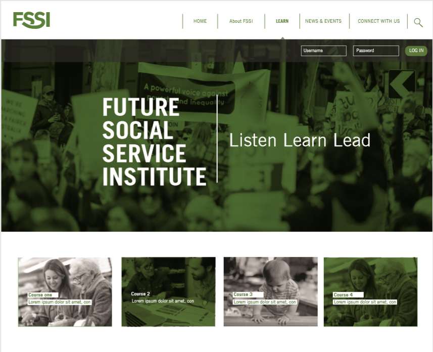
(First FSSI login design)
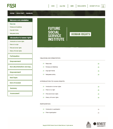
(First course dashboard design)

(First banner visual style)
Stage #3: Tidy up your room! – Minimalise the interface
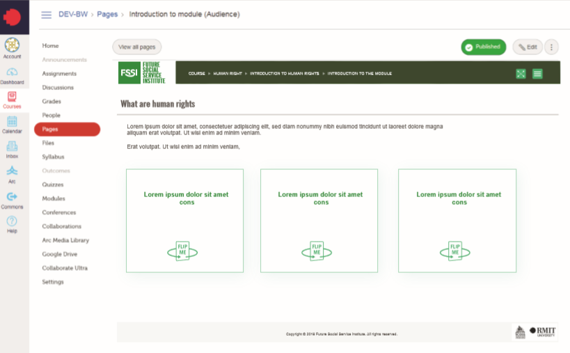
After a few more meetings with the client, we had a better understanding of how the client would be using the course package. The course packages would be embedded in different LMS and clients needed to be able to freely move and rearrange individual modules within a course.
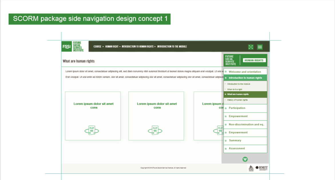
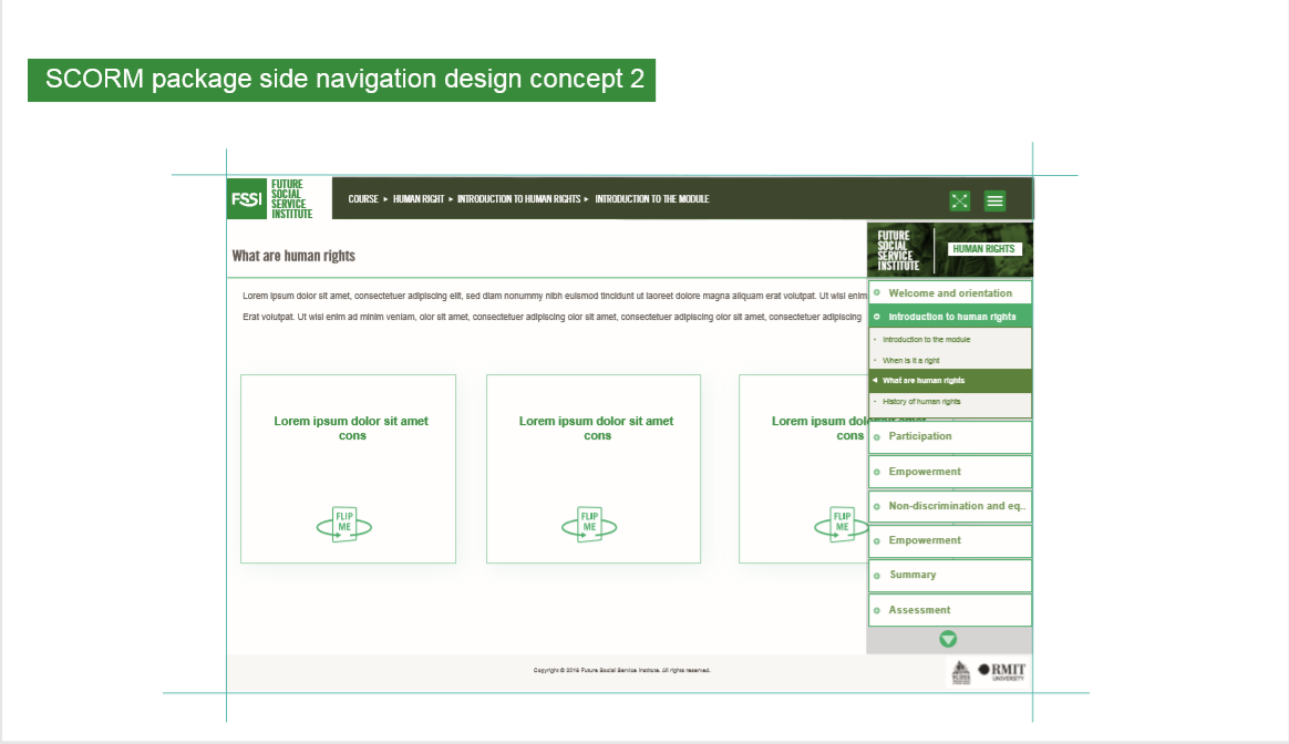
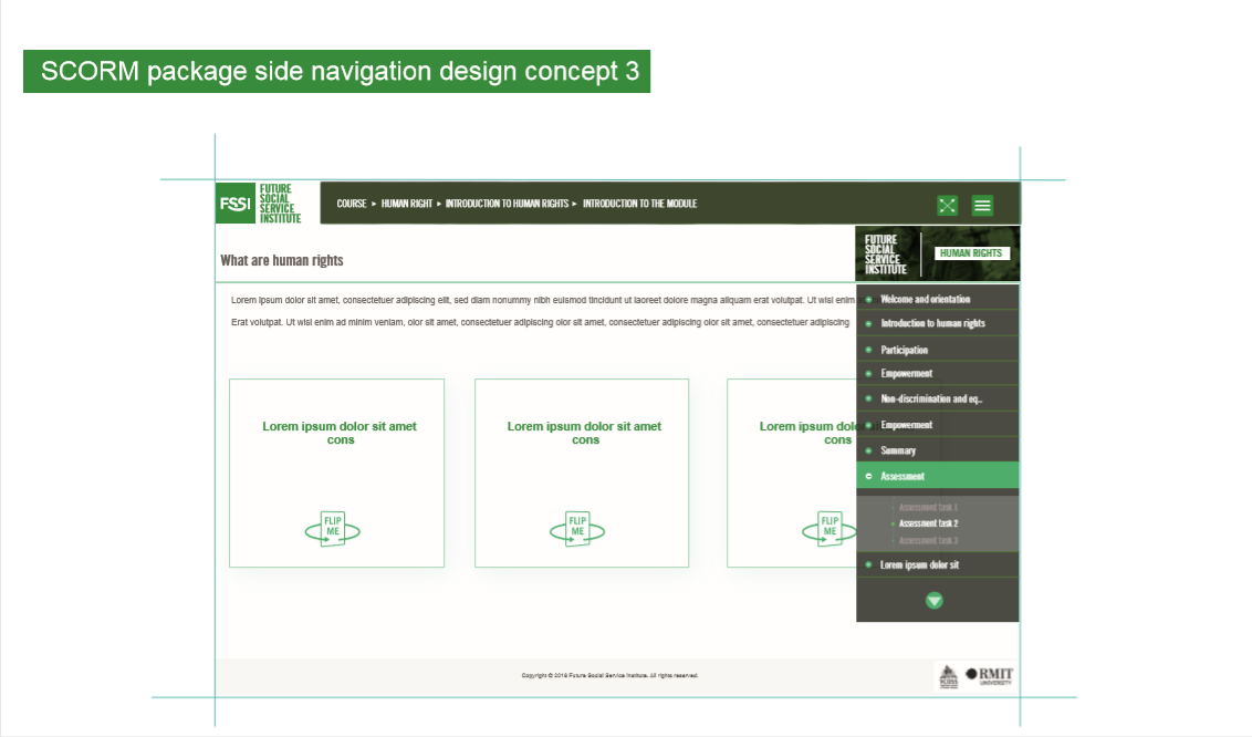
To avoid confusion in navigation, the FSSI course interface had to be as clean as possible. To achieve this, I removed the traditional side navigation menu and added two buttons to the top right corner. The first button ![]() allows users to change from Canvas view to full screen view. The second button
allows users to change from Canvas view to full screen view. The second button ![]() brings up a navigation panel so the user can know what page they are on in the module and jump between pages.
brings up a navigation panel so the user can know what page they are on in the module and jump between pages.
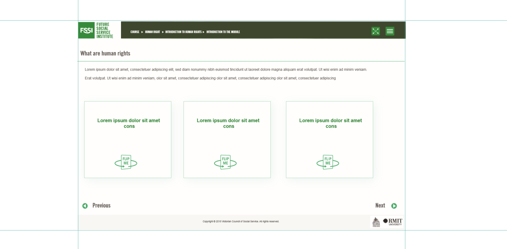
(Course in canvas view)
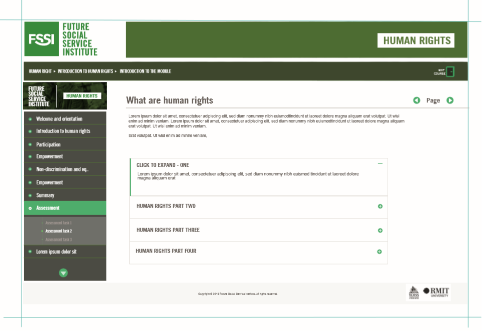
(Course page in full screen view.)
Stage #4: Don’t get lost – The navigation design
Once the interface design structure was locked in, I continued to develop the colour scheme for the navigation panel. The colour scheme had to balance the interface’s positive and negative spaces.
After doing design comparisons, mock-ups, and considering the feedback from others, I decided to use the darker navigation panel colour scheme to balance out the white positive space of the rest of the interface.
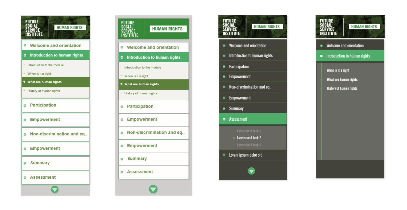
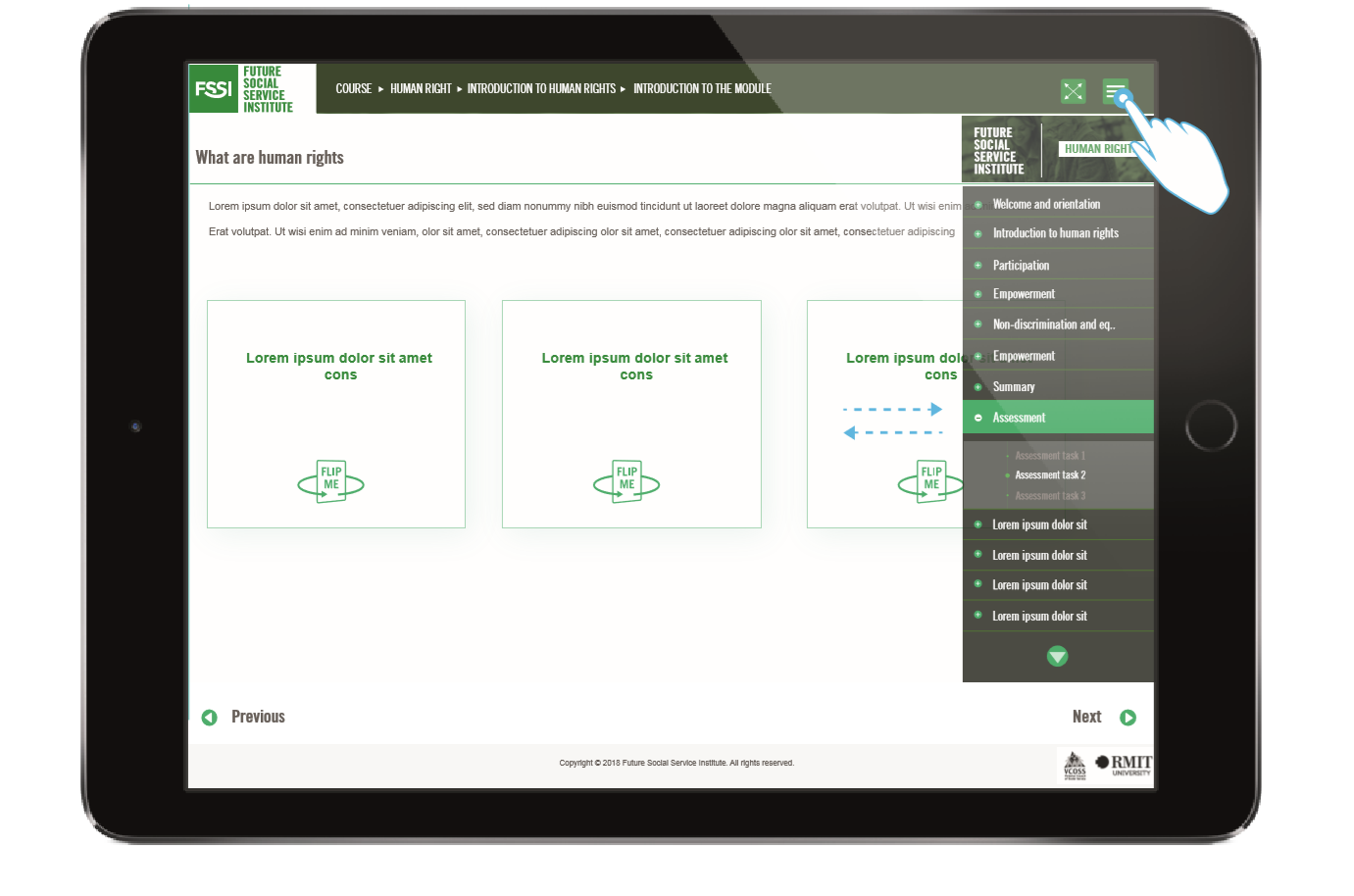
To make the course more accessible, the interface design had to translate well onto other devices like iPads.
When users view the course on an iPad, they can choose to show or hide the navigation panel using the ![]() button. When they tap the button, the navigation panel slides into view from the right-hand side. By tapping anywhere on the page, the navigation panel slides back out of view.
button. When they tap the button, the navigation panel slides into view from the right-hand side. By tapping anywhere on the page, the navigation panel slides back out of view.
Stage #5: xoxo / The K.I.S.S design principle
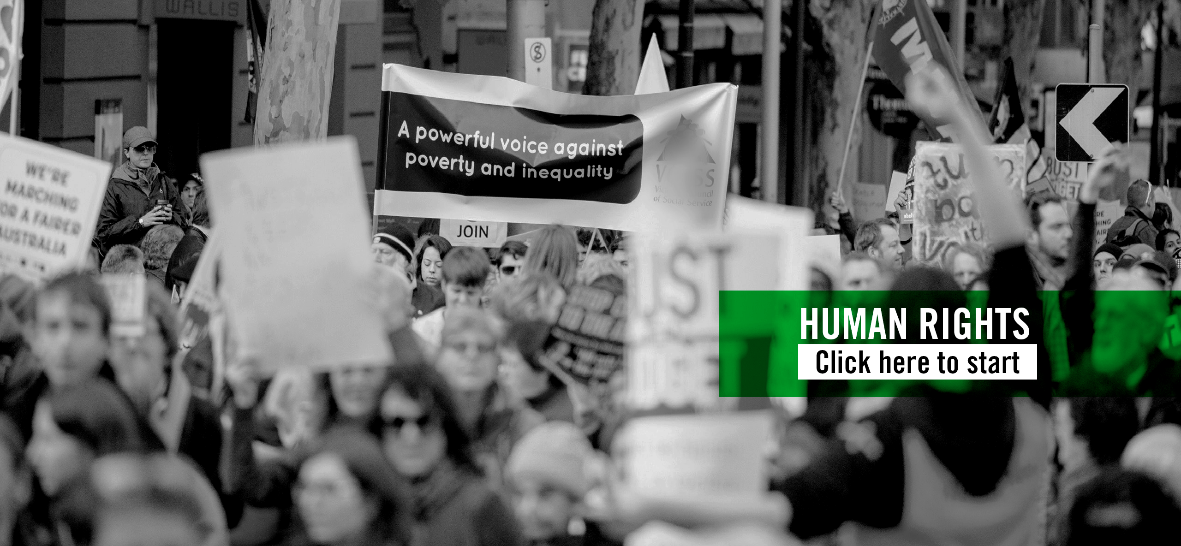
This course uses a lot of photographs because images can communicate specific purposes, feelings, and meanings to a broad audience of different backgrounds and languages. This made them a perfect design component choice for FSSI.
Below are two graphic and image style concepts I developed. I tried to use FSSI’s brand colours to balance out the images, but I felt that they looked too busy.

After much experimenting, I decided to keep it simple. As Albert Einstein has said, “Keep it simple, stupid.” Simplicity is a fundamental design principle.
To keep it simple and straightforward, I selected black and white images and used white and green for text titles.
Stage #6: We look different but are the same inside – Reskinning the current interactive activities.
Another essential part of this course package are the interactive learning activities. We have many interactive activities templates built and ready-to-use for creating courses, however, how these templates look didn’t fit with the FSSI world. I had to re-design the visual styles of a few interactive templates to make them match the course package interface.
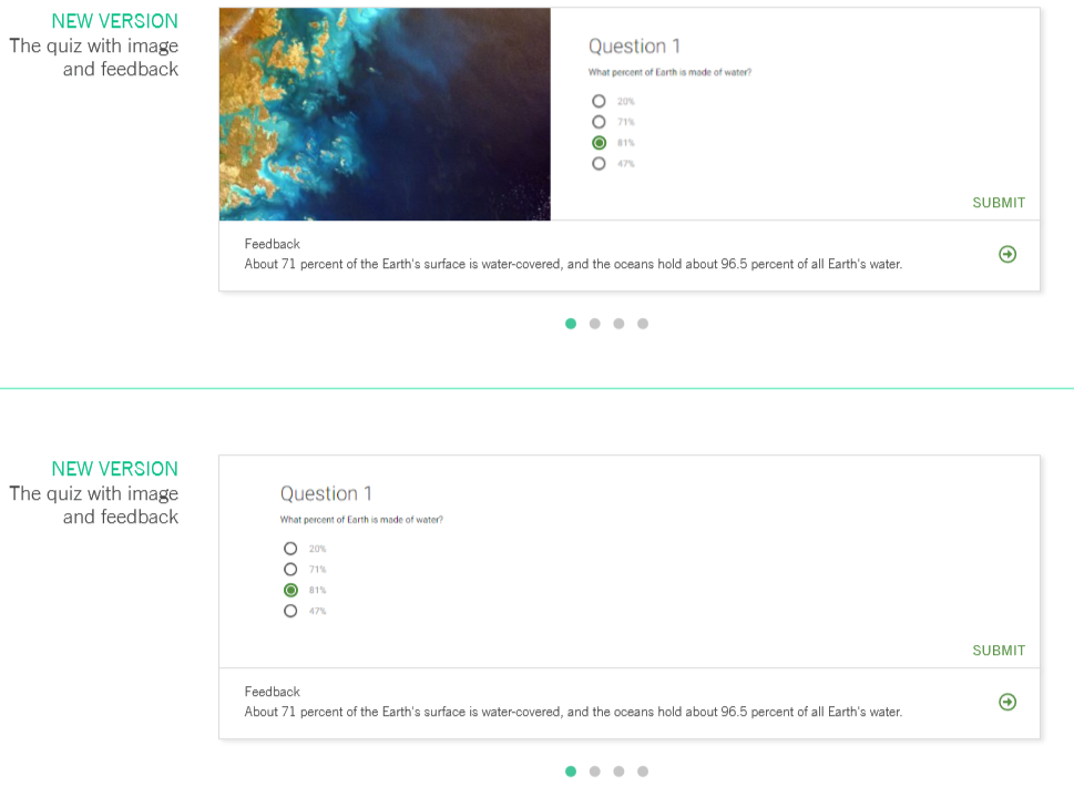
For example, the new version of the quiz gives learning designers the option of including images in the design of their questionnaire. Overall, the design looks more elegant and fits with the rest of the new FSSI interface.
Least but not last: What’s the plan? – Student journey (UX)
In addition to the FSSI online learning package requirements, the package also had to meet RMIT’s 14 elements for creating the best student journey. This includes a:
- dashboard and select their course
- course homepage
- welcome video
- course information
- about the badge
- assessments summary
- my progression through this course
- individual modules
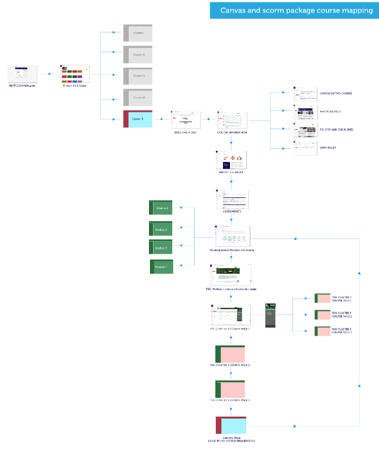
(UX journey mapping)
Bye for now – Conclusions
It’s been a fun experience designing and developing the FSSI shareable course package. I greatly appreciate the design opportunity and for your attention. I hope you found this journey to be an interesting read.
Enough typing for me. I will get back to work and keep designing, growing, and learning.