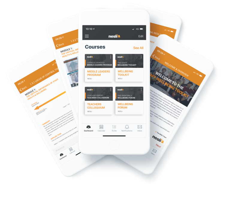
By the end of 2019, approximately 80% of our internet usage will be through mobile phones. So why not use them to our advantage? Why not design our learning experiences to suit mobile first and foremost?
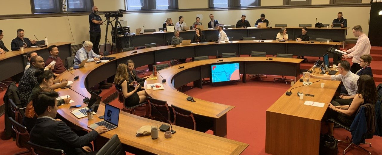
In this month’s Think Tank expert panel session on September 16, the VEDT proposed the following question:
What is best practice in, and potential impacts of, mobile-first design for VET, industry and skills training?
Our experts for this panel discussion were:
- Colin Hickie, Head of Learning Design and Production – NESLI (National Excellence in School Leadership Institute)
- Stacey Murray, VET Author and Content Writer
- Damala Scales Ghosh, Lead Learning Designer – The Learning Hook
First up was Colin Hickie, who emphasised a pedagogy-first approach, asking the question that many teachers echo: How can mobile learning engage with your audience in a way that face-to-face/online cannot? Colin also discussed NESLI’s focus when designing for mobile, ensuring that content is quick and accessible, easy to navigate and activity heavy to support engagement.
Colin finished with an intriguing point that made all learning designers quake in their boots. Imagine the data collected from mobile learning could be used to evolve the content and learning style automatically. For example, you whiz through a practice quiz and get all questions correct, so similar questions are removed from the summative assessment to avoid repetition and increase the challenge. This design-as-you-go approach could have a major impact on the education sector.
Second up we had Stacey Murray, who balanced her writing expertise with mobile-first design. Stacey recommends fostering student engagement with mobile-based content, paying particular attention to text chunking, effective use of white space, headings, infographics and video. Only by fully utilising your existing platform can you produce something innovative. She stressed the importance of captioning videos, as the majority of videos are viewed with the sound off these days. She also reminded us to design for vertical usage, something we already see with many blog websites.
Stacey’s final comment touched on the issues surrounding mobile-first design and assessment. While we have a wealth of formative assessments such as drag and drop, practice quizzes and matching activities, the governance of summative assessment with mobile-first design is difficult. How can we be sure that a student’s work is their own?
Our final expert was Damala Scales Ghosh, who approached mobile-first design from a learning designer perspective. Her first point was the most powerful:

Mobile-first is the most inclusive approach.
Students are more likely to have a smartphone than they are a laptop. To engage students from there, you just need to follow her five tips:
- Know your tools (and choose the right one for the job). If you want something quick and easy, use Articulate Rise. If you want customisable, use HTML.
- On the grid design that will adapt to every screen.
- It’s hip to be square-ish – Instagram had it right with squared images, they suit any screen.
- Less is more. Best practice is plain language, simple bulleted lists and minimal punctuation.
- The sticky-note rule: can your information/content fit on a sticky note?
Many interesting discussions ensued. The following a merely a few key points; to hear more, please watch the panel session in full.
- Mobile-first design is great as long as there is infrastructure to support it. If regional students can barely access stable internet, how can they work effectively on mobile?
- Mobile-first design caters for more learning styles.
- Teachers need to be prepared and trained to support their students in the use of mobile learning. Enable teachers so you can enable students.
- What tools can be used to encourage accessibility in mobile-first design? The Hemingway app was suggested, particularly for plain language.
- How can we ensure information is digitally accessible?
