The VE Design team held another Panel Session on March 28, to discuss and explore ways on improving accessibility across teaching and learning experiences. Today, digital accessibility touches nearly every aspect of educational institutions: applications to websites, courses, resources used in programs, services, and activities. We had a panel of experts including:
- Andrew Normand – Web Accessibility Lead, University of Melbourne
- Michael Meehan – Dean: Faculty of Foundation Studies, Box Hill Institute & Centre for Adult Education
- Brendan Carter – Creative Director, The Learning Hook
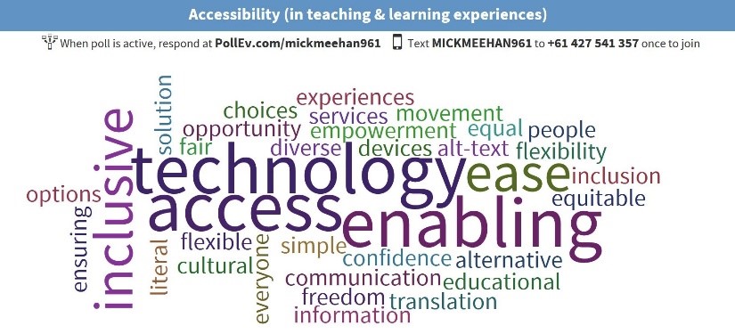
What does accessibility mean to you?

Panel member, Michael Meehan directed this question to the audience. Whilst the question was simple, it was a clear indicator that accessibility is diverse in its meaning and applications across members of the educational community.
Michael stated that whilst everyone has different definitions and approaches when it comes to addressing accessibility within education, we need to change our approach and have it in the forefront of our thinking at all times.
Michael indicated that Box Hill Institute continues to see growth patterns of the number of students identifying with disabilities annually. In 2015, they had 733 students who identified with disabilities and have since had a consistent growth pattern with data in 2018 indicating that 2292 students identifying with disabilities are enrolled at Box Hill Institute.
With these three-fold growth patterns moving forward, Box Hill Institute have made a commitment to increase their staff ratio of employers to at least 6% of people working with disabilities (2019) with the objective of 12% staff ratio by 2025.
Michael expressed that accessibility is essential in ensuring equity and inclusion. Whilst Box Hill Institute has a strong commitment to accessibility for all, it’s still increasingly evident that moving forward we need to change our mindset. Michael shared a moving experience he was part of involving a recent student graduation ceremony.
In a typical student graduation format, students were instructed to line up and enter the stage from the left-hand stage door, walk across the stage collect their graduation certificate from presenter (Michael) and then exit the stage to the right.
Peter a student in a wheel chair, who was part of the graduation ceremony was positioned on the right hand side of the stage door. As each student entered from the left side of the stage Michael simply read their names from the student’s name badge, presented their certificate and moved onto the next and so on. Peter missed his turn because he was located on the right-hand side of the stage as the event’s team simply located the accessibility ramp in that position and Michael was unaware he was there.
Michael believes simple things need to change and in Peter’s experience we need to question why the ramp wasn’t positioned on the left-hand stage door with the student cohort for inclusion and accessibility. Accessibility needs to be in our mindset at all times.
Collaborating with teachers, support services, events teams and speaking directly with end users are future approaches that need to be adopted and be in the forefront of our thinking for real change to happen.
Most people in education understand that accessibility is essential when designing learning experiences and resources however often there is a gap of dividing the responsibilities. Panel member, Andrew Normand quoted “accessibility takes time and responsibility” and raised three key questions that his team adopts when exploring learning and designing digital spaces with accessibility on the forefront.
- How do we divide responsibilities?
- How do we identify solutions and think outside the box?
- What are our sources of support and what can we do to build support?
Andrew presented a detailed and formative responsibility checklist that covers important areas that need to be addressed when designing with accessibility in the forefront.
Integrating translation and accessibility into learning spaces is an ongoing process. Learning designers, trainers and multimedia teams need to continually explore ways of more than just translating materials for readability purposes but consider the learning experience for the end user.
Andrew raised the point that often translated and accessible versions of resources are produced in limited time frames and focus on the translation process rather than the educational learning experience.
When addressing accessibility, designers and multimedia teams generally concentrate their focus on the translation aspect when it comes to learning activities and resources and overlook the bare basics of the educational objectives of “What does the end user need to learn?” and “What are we trying to teach them?”
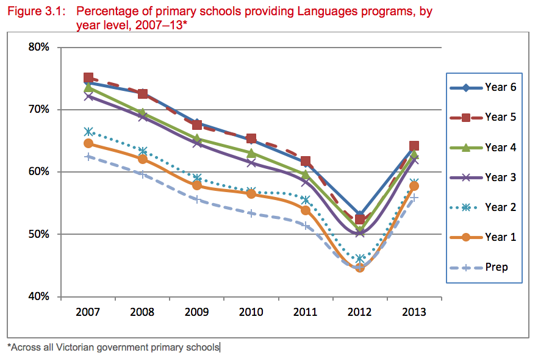
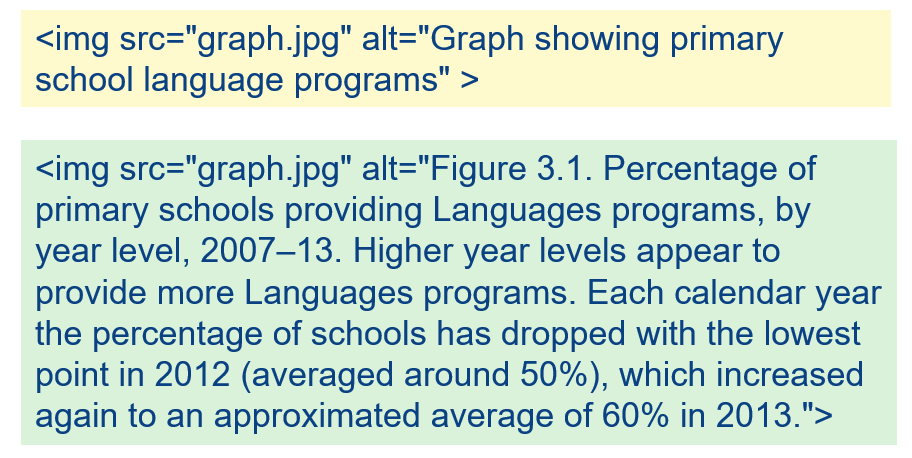
Andrew supported this theory by presenting an excellent example of how alt tags can be incorporated to meet learning objectives and implement a teaching voice approach.


Andrew believes the educational community has come a long way with accessibility in education, but we still need to address the gaps, build support structures and digital capital to close the technology gap.
Awareness starts with getting accessibility on the agenda. Sharing stories can play a big impact when creating awareness, stated learning solutions expert Brendan Carter.
Brendan raised a valid point stating that most educational providers and designers can meet the basic standards and guidelines surrounding accessibility however the focus should be on connection and the end user’s overall learning experience. Inclusive design and user interface such as colour, typography, content and structure all need to be considered, but how does one incorporate accessibility as part of an everyday work flow for the educational community?
Brendan presented the Document Accessibility Toolbar (DAT) which is free accessibility ribbon menu for Microsoft Word. The DAT has been designed for everyone to implement and is simple way to create accessible documents. The DAT was pioneered by Vision Australia and features a range of hand picked and custom build functions to optimise and validate a document for accessibility.

Brendan complemented this smarter approach to accessibility as it’s a new way to build awareness and is essentially driven from the ground up. With everyday users downloading applications like the DAT and applying accessibility to their workflow, it’s a great start to raise awareness and adapt accessibility in day to day processes.
Connecting knowledge to action and how the creators of content are communicating and meeting learner’s needs is a necessity and must be a key focal point when designing and building content that’s accessible. Working with end users and gaining insight on how we connect and communicate is a key action moving forward.